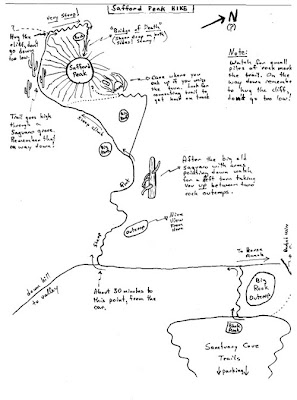
 Interesting feature by Julia Turner at Slate on why hand-drawn maps are sometimes more useful than those generated by Google or Mapquest.
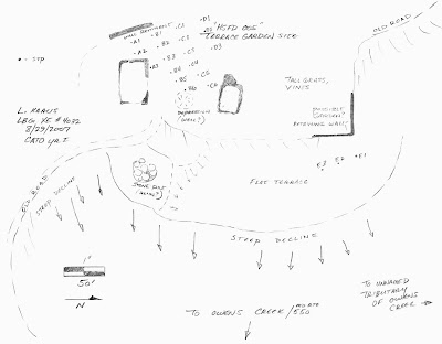
In archaeology, I find hand-drawn sketch maps extremely useful. A sketch like the one below, by my former colleague Lisa Kraus, provides more information about a site than you would get from even a very detailed topographic survey. A trained eye can pick out things about features that are barely present in the physical data; I have often been surprised to find that a feature that looks perfectly round to my eye shows up in a topographic map as a couple of lumps in a vague trapezoid. An experienced archaeologist can spot patterns within the noise, seeing rectangular foundations within piles of rubble, or patterns of ditches and banks so subtle they would only show up on a topographic map with 1-centimeter topo lines.
On the other hand there are things for which sketch maps are not accurate, like gauging the distances and alignments of widely separated features. For that sort of thing, an accurate survey as essential. So ideally you would have both an overall site plan based on a real survey or an aerial photograph and a sketch showing the interpretations of the archaeologist.


1 comment:
From a mathematical perspective, drawn maps are "topologically" correct, in that they represent the relationships between locations while ignoring distances. Similarly for oral directions, like: "Follow Brattle Street past the third light, and take the next right." "Follow Brattle Street" says little about the shape of the route, and "third light" says little about the distance (although we have some expectations, for instance, that the lights won't be ten miles apart and that the road will probably be relatively straight.)
Of course, drawn maps can obscure. In an academic setting, they might reinforce assumptions that you've made. As with all efforts to convey data, you are selecting the data to present, which not only directs your readers eyes to what you want them to see, but also, potentially, not allowing the reader to see something you've missed.
Think of the annotated aerial photos from Colin Powell's UN presentation on WMD in Iraq. The labels on the maps might or might not have had anything to do with what was actually on the ground, but without the aerial photos, we don't have any way to rebut Powell's interpretation of the data: "Hey that's not a mobile weapons truck, it's clearly an ice cream truck. That's obviously a clown face on the top."
Post a Comment